
Note: All images are courtesy of Inge Johnson/Canada Running Series
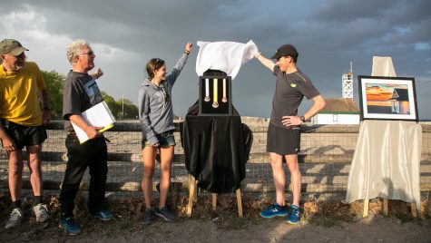
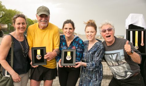
Artist Inge Johnson has masterminded the design of the Scotiabank Toronto Waterfront Marathon (STWM) finisher’s medals since 2008. With the exception of a few years where Inge directed another designer, the medals – the photography, design, ribbon, etc. – have “been my babies,” Inge tells me the morning after the 2017 STWM medals were revealed by Lanni Marchant and Reid Coolsaet at a community run led by the folks at RunTOBeer.
I ask Inge how many medals she thinks she’s designed for Canada Running Series (CRS) over the years. A rough calculation lead us to the conclusion that Inge’s photography and design have been the basis of at least 70 different medals.
I take it one step further and ask Inge how many runners across the world must have at least one of her medals based on a rough estimate of runners crossing the finish line at CRS races each year, but we both immediately agree that it’s too early in the morning to be doing that kind of math.
What we do know, according to STWM Race Director Alan Brookes, is that 26,000 runners representing seventy-odd countries will be on the course on October 22nd.
Over the years, a runner can amass enough medals that many lose their distinct value, becoming clutter rather than beloved keepsakes. Inge understands this and it informs what she calls her raison d’etre as a designer. The medals Inge designs are meant to be more than tokens of a race completed.
At Rorschach Brewery, where this year’s medals were on display during festivities following the run, Inge told me, “I want someone to feel that they’re looking at a piece of art. I want to make it meaningful to the runner who earned it.” Over the phone, Inge adds that there are two elements playing off one another in each medal. “One half is the artistic side and the other half is the achievement it represents and I want to make the art match the achievement.”
If the art is powerful enough, it not only stands out among masses of other medals, but has a unique ability to recall the experience of a particular race when we pass it hanging on our display rack or perhaps, like Reid Coolsaet, go through the contents of our closet.
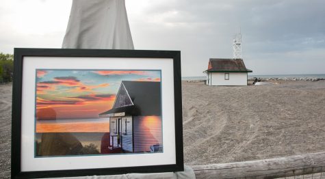
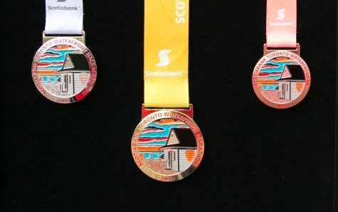
Since 2008, the “Landmark Series” of STWM medals has featured iconic Toronto images, matching the landmark achievement that is the the marathon. This year, Inge knew that CRS wanted to go to Toronto’s Beaches, not having ventured to the city’s east end since Kew Gardens was featured on the 2011 finisher’s medal.
Inge recruited Beaches resident and longtime CRS friend Erwin Buck to provide the image she would interpret for the medal’s final design. In describing Buck, Inge says, “I want to be Erwin when I grow up.” A former CFO at McLaren McCann, now McCann Canada, Inge especially admires Erwin’s journey from executive to “a creative person and artist, writing novels, and exploring later in life.”
Erwin’s pursuits also included a stint on the CRS photography crew and running 32 marathons.
There were a few potential landmarks discussed for depiction on the medal, including the RC Harris Water Treatment Plant and the historic fire station located at Queen and Woodbine, but Erwin insisted that it had to be the Leuty Lifeguard Station, one of the oldest surviving landmarks on the beach. Erwin’s Instagram page shows a clear and strong affection for the station, often making his way to the beach before sunrise to capture it from different angles and in varying light.

The image that Inge settled on was one that, “kept speaking to me and pulling me in.” It also made for what she called her most difficult experience designing a medal. Inge’s chief dilemma was that, “Erwin’s photo has so many gradients of colour; how do I transpose that to a medal where I’m working with 5 colours?”
One particular challenge was the light casting onto the side wall of the station, which meant incorporating additional colour into the wood planks depicted in the medal. The different colours and elements were achieved by solid enamel, heated and held in place by metal walls between them, each interacting differently with light to recreate the living feel of Erwin’s photo.
With all the difficulty of interpreting Erwin’s image, Inge says the unquestioned highlight of the reveal was the fact that Erwin was “over the moon” when he received a framed medal from CRS, which confirmed that she did justice to her friend’s work and created the piece of art she aspired to.
Which are you taking home in October?
- Ravi Singh


 Our Magazine