By: Tim Huebsch
How do you sum up 365 days of running in a single thought? Well, don’t they say a picture is worth a thousand words kilometres?
What you’re about to see is a year of running summed up in four photos, all showing you slightly different characteristics of the same 365 days of running. Basically, the photos are extrapolations of my own personal GPS watch data, turned into eye-catching graphs and maps with data pulled from Strava, a social fitness network.
Facets
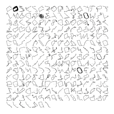
The facets are the most overwhelming visuals on first glance.They look like a bunch of wingdings scattered across a page. But, when you realize what you’re looking at, the data begins to make sense. Each individual pattern represents a run, in chronological order, and from left to right. As you can tell, it wasn’t a great year for running consistency. Popular patterns include track workouts (ovals), loops and straight lines (warmups and cool downs). If you look closely, the route is superimposed on top of the actual distance.
The facets, in my opinion, best sum up the year. There are so many different stories that can be pulled from your runs. Exploring new places, running longer than you ever have before, or getting lost and tacking on an extra 10K to your long run accidentally. The facets offer vague reminders and clues of each of those runs.
Map
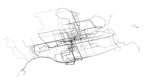
The most visually appealing version of the visualizations is the map feature. Take a second. Can you guess what city this is just by the outlines of runs?
Basically, the map shows every single step I took and uploaded to Strava in 2018 within the Toronto. The darker the lines, the more times I retraced that same route, as a whole or in part. You can even pick out certain landmarks on the map including the Martin Goodman Trail, Humber River, Ontario Place, Riverdale Park, Monarch Park Indoor Track Stadium and the Leslie Spit, to name a few. (Click here for 2017’s.)
Calendar
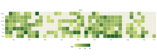
 The calendar is pretty simple, showing every one of my runs tracked by GPS data for the year.
Any day with a shade of colour represents a distance run greater than zero. The lighter the shade, the less distance covered that day. The darker, the greater the distance covered. As you can tell, there are significant periods during the year when there was no activity at all (and thus, no colour on the calendar), due to injury, rest or not running with a watch. Distance is calculated in kilometres.
Ridges
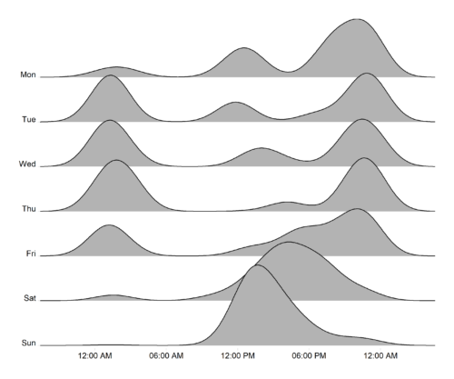
 Do you have a favourite time of day to run? Perhaps it’s at 6 a.m., before work, when the roads and trails are empty. Or maybe it’s a 8 a.m. run-commute followed by a 5 p.m. return trip. Or you’re a night owl, and get in your runs well past dark and just before bedtime.
The ridges in this visualization weigh the pattern of the time of day I ran most in 2018. Clearly, I enjoy evening runs on weekdays, and daytime activity on Sundays.
Melbourne, Australia-based Marcus Volz, who has a PhD in engineering & applied mathematics, is credited with creating the framework to display the data in such a visual way. In 2017, Volz shared all of his runs between 2011-2017 on his Twitter account making for an incredible collage of activities (including a few kangaroo-shaped runs, which represent the route of the Melbourne Marathon).
Curious as to whether you can do this yourself? Anyone can create the artistic visualizations with their GPS data as Volz publicly shares the instructions online via his Github, an open-source platform to share computer code.


 Our Magazine
